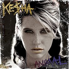
Ke$ha is an artist of the pop/dance genre, which is highlighted in her digipak cover for 'Animal'. The close up of Ke$ha takes up most of the cover, and links to the theory of E. A Kaplan and Laura Mulvey's theory of scopophilia - imploring people to look. Close ups are very typical in the pop genre. The plain black background makes the titles stand out, and the glitter that they are written in links to Ke$ha's personality as she usually covers herself in glitter for live performances. Her glittery makeup is a way of portraying her party girl image and shows that she is all about having fun and being crazy, but her serious expression shows that she is feisty.
The font is also very edgy and links with Ke$ha's rebellious nature as well as it also being fun. Apart from the colours and font, the layout of the digipak cover is pretty simple (artist name, picture, album title). But the gold colour font suggests glamour.
This cover has given me a lot to think about for when I create my digipak cover. Where will the titles go? Will I want them to be as eye-catching as Ke$ha's or more discreet? As we have not used "the band" in our music video we cannot use the artist for the main picture, so what will I use?
This cover has given me a lot to think about for when I create my digipak cover. Where will the titles go? Will I want them to be as eye-catching as Ke$ha's or more discreet? As we have not used "the band" in our music video we cannot use the artist for the main picture, so what will I use?
very good but what will you take from this to develop your own cover? M
ReplyDelete